Tips and Tricks for Making Your Emails Mobile Friendly
By: Andrew Lisa
When you send an email, assume it will be opened on a mobile device. Emails that aren’t optimized for mobile are hard to read, difficult to navigate and easy to close and ignore. Emails should look great on desktops, but also on cell phones and tablets. This way, your recipients have no problem reading them when stopped at red lights, at dinner with loved ones and anywhere else smartphones are used.
Subject Lines: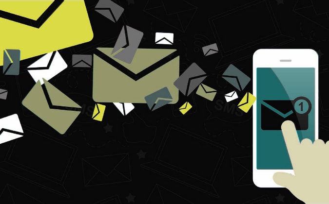 Less is More
Subject lines should be short, containing just a few powerful words — like newspaper headlines. Anything over 40 characters and you run the risk of your subject being cut off and disappearing into ellipses oblivion. Long, convoluted subject lines lead to unread emails.
Bigger is Definitely Better
Get your mind out of the gutter. We’re talking about fonts, here. On a smartphone, 11-point font looks like the fifth line down on that chart they make you read at the eye doctor’s office. Everyone who isn’t Gilbert Gottfried hates squinting. Don’t go under 13 points, and consider taking it all the way up to 15. Don’t get fancy. Avoid web-embeddable fonts and stick with the tried-and-true HTML options like Georgia and Arial.
Stack Pancakes, Not Links!
Links are like rival gang members in prison — it’s best for everybody if they are kept far apart from each other. Fingers aren’t stylus pens. When someone tries to click your phone number, but they accidentally click your email address because the two links are right on top of each other, that person hates you forever.
Focus on Formatting
Stick to one column. Multiple columns on small screens create clutter, reduce visual impact and increase the odds that it won’t look good on different devices and platforms. Most importantly, it makes people zoom, and people want to zoom about as much as they want to install another Adobe update.
Don’t make your email more than 600 pixels wide, which is the industry standard because it fits virtually all screens. Many devices can handle more, but you should play to the lowest common denominator — because it is sadistic and evil to make anyone scroll side to side just to read your email. Also, avoid using background images, menu bars and other visual distractions.
Picture Perfect
Most email platforms block images by default, so avoid using them to display crucial information. If you use images, keep them low-res. Although bandwidth is less of an issue than it used to be, high-res images may take a while to load, which gives your recipient time to loathe your existence and unsubscribe.
Calls to Action
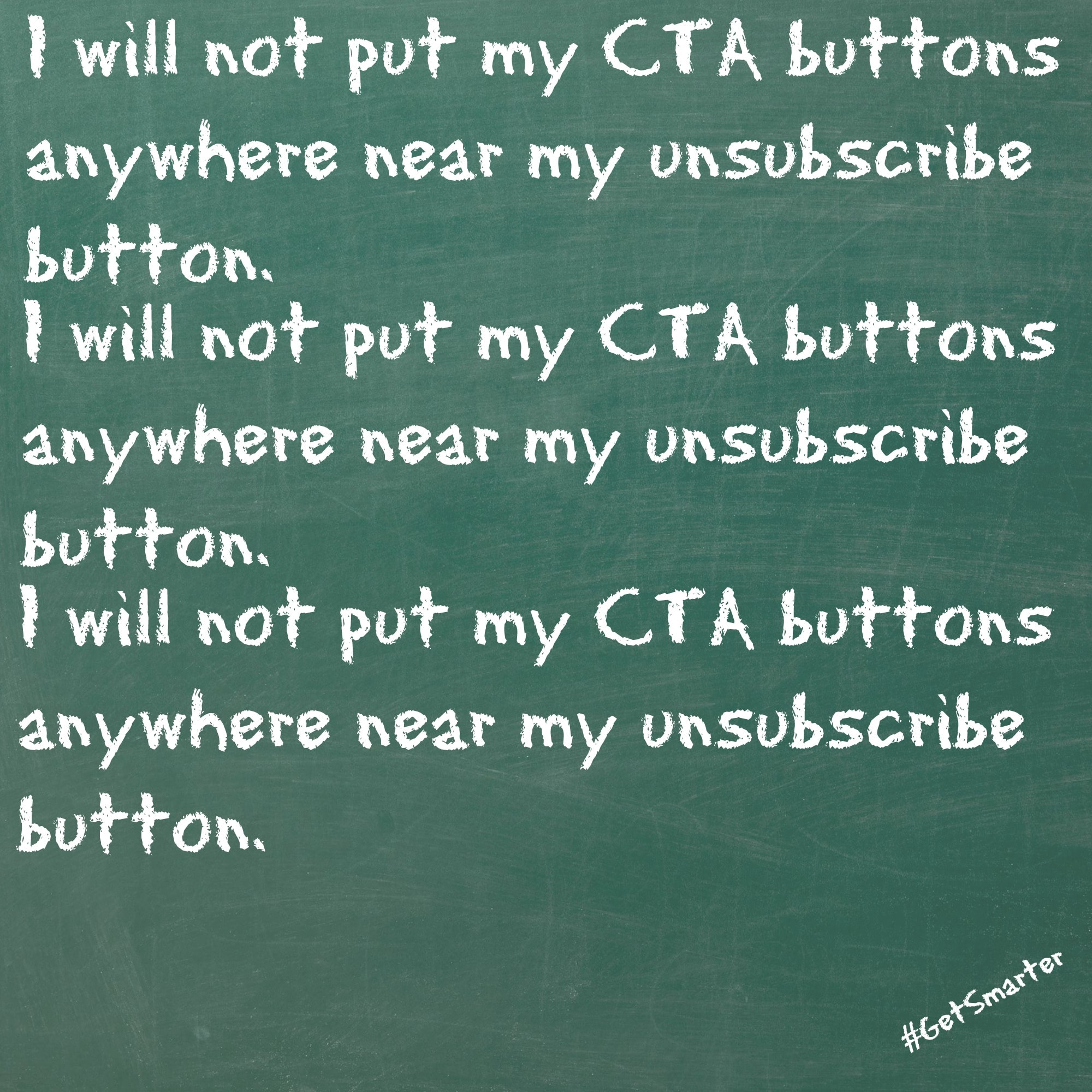
Include a specific, clickable call to action. Don’t make it an Easter egg hunt. CTAs should be obvious and should show up in more than one place. Now repeat the following phrase three times while holding a rabbit’s foot:
I will not put my CTA buttons anywhere near my unsubscribe button.
Before you hit “send,” make sure to test your message on multiple devices, both Android and iOS. Beyond that, the basic rules of traditional email marketing apply. Make messages scannable. Avoid large blocks of text, stick to the central message, put the important stuff at the top and always offer something of value.