Landing pages are not good multi-taskers.
Every landing page is built to do just one thing, and is designed to guide just one type of visitor toward 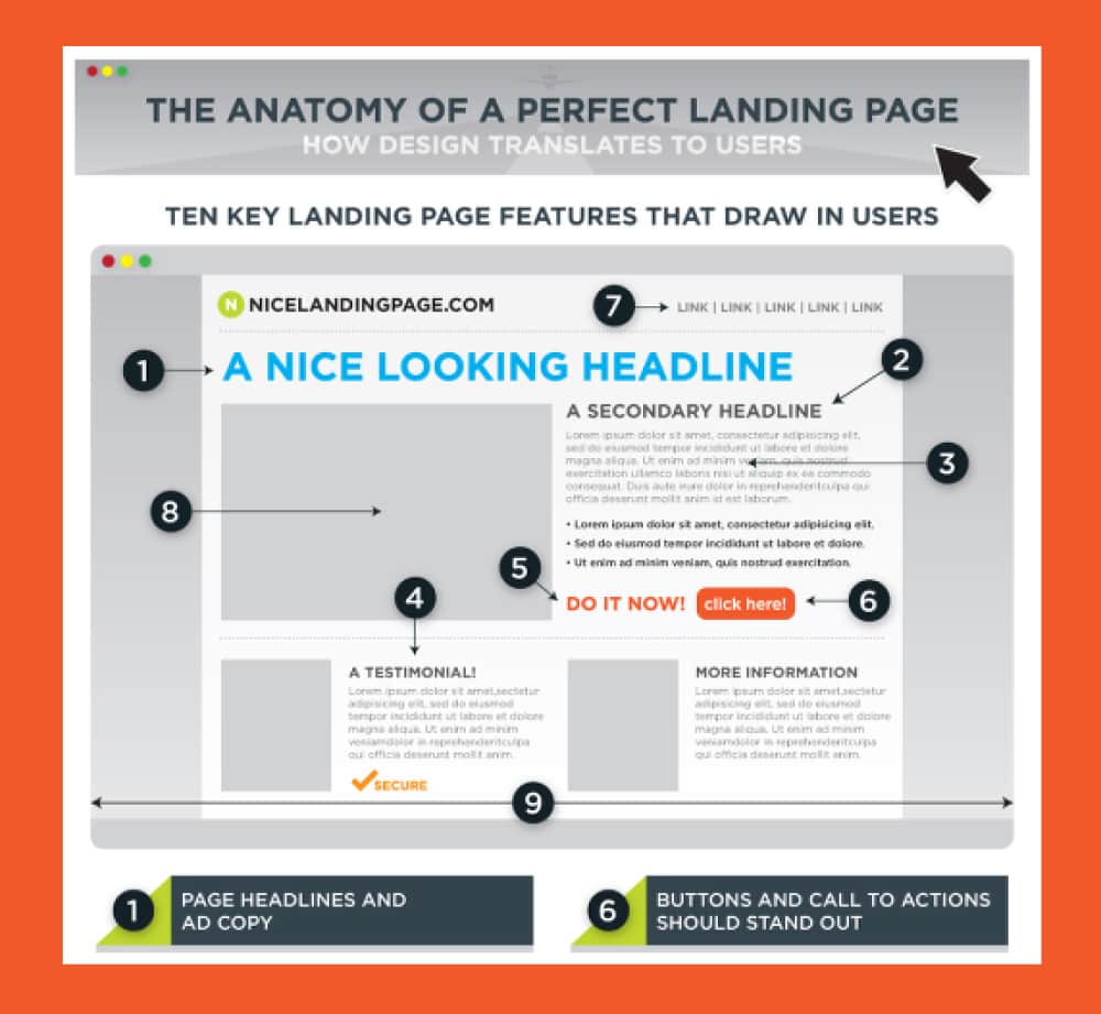
But so many businesses — even some large, established brands — continue to use a single set of landing pages for both social and PPC. Don’t cut this corner. If you do, you’ll never achieve the number of conversions or level of ROI that comes with dedicated landing pages. This rule applies for all entry points, but most dramatically for social and PPC.
Why, you ask?
Opposite Ends of the Funnel Do Not Attract
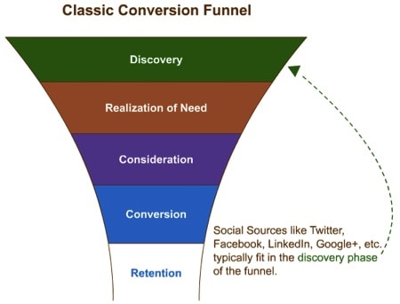
When visitors land on a page from social media, they are usually coming from at or near the top of the sales funnel while in the discovery phase. Pay-per-click visitors, on the other hand, are arriving from at or near the bottom of the funnel.
What does this mean?
It means that PPC visitors have probably already decided to buy. They’ve hit all the touchpoints on the ever-tightening funnel during their purchasing journey from discovery to click. They’ve done the research, read the blogs, joined the affinity groups and scoped out the competition. They are waiting for the right time — and the right price — to pull the trigger. Social visitors, however, probably just discovered you. It is likely that they are not at all familiar with your brand or product.
A single landing page can not possibly accommodate both of these visitors.
Start With the Basics, then Tweak for Social
Like all landing pages, social LPs should:
- Mirror the language, layout, design, images, fonts and color scheme of the ad.
- Be clean and uncluttered with no navigation bar.
- Contain short, powerful headlines that summarize brief, concise copy.
- Convey a clear value proposition.
- Contain obvious, compelling calls to action that stand out and contrast.
Create unique landing pages not just for social — but for every different social network. The look and feel of your LP has to reflect your ad, so visitors from Twitter can not land on the same page as visitors from Facebook. Each social media network has different best practices for image and ad dimensions, so for the sake of continuity, landing pages have to be unique to the network.
That might sound like a whole lot of very similar LPs — and that’s exactly the point. You get better results with more landing pages. According to VentureBeat, businesses with more than 40 landing pages got 12 times more leads than those with five or fewer. Businesses with at least 30 landing pages got seven times more leads than those with 10 or fewer.
If visitors have made it to your landing pages, congratulations — you’ve done everything right up until now. They noticed your ad. Your content enticed them. Your social posts convinced them. Don’t blow it now by trying to cut corners at the finish line.

