Your website is easily one of the quickest and easiest ways to extend your personality. Let’s take a look at a few gifted companies that really make their site work for them. This week, since it’s the first installment of this series, we’ll look at the home page
Swiss
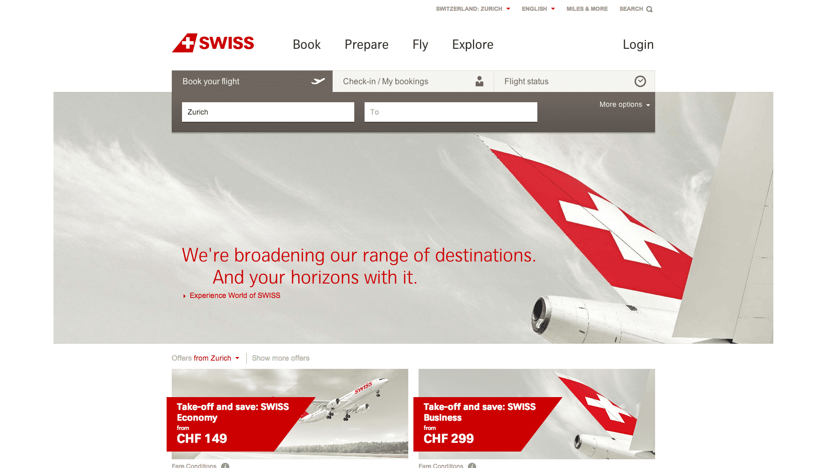
In true Swiss fashion, this site maintains a spotlessly clean look. The color is rich without being flamboyant, and the amounts of elements are minimal, making it clear.
Highlights
If we dissect this snapshot of the homepage, there are basically 4 elements.
- Navigation6 clear areas to navigate in plain, easy to understand language.
- Functionality PlacementThis is my favorite part of the entire homepage. Swiss knows their customers, and by placing this all-in-one booking, bag checking, and flight status tool this way it made access to it effortless. Front and center, this element breaks the frame of the eye-catching hero image below in a way to say “I’m important, and my function follows this mentality”.
- Hero MessageAs said above, this eye-catching piece allows Swiss to says exactly what they want to portray.
- Extra InformationThis extra section may fall lower on the hierarchy, but that’s exactly how it’s designed. Two dynamic special offers that help users know that there are deals. Then it navigates away as to not muddy the homepages image.
