Main Elements of Visual Branding | Becoming a Sequoia
By: Michelle L. Cramer
There is a reason Instagram is so successful – and it’s not because of self-absorbed teenagers who are addicted to selfies.
It’s because we are a visual people. The evolution of a technology driven society has us craving instant gratification. We want to exemplify the old adage that “a picture is worth a thousand words.” There should be a full blown story in just one shot. Because, honestly, that’s all the attention span anyone has these days.
Which is why you absolutely must tighten up the visual aspect of your company’s brand identity. Your logo, your color scheme, the way you arrange your website and the cover photo on your Facebook page: all of these visual elements will either spurn more attention from your market, or see them moving on.
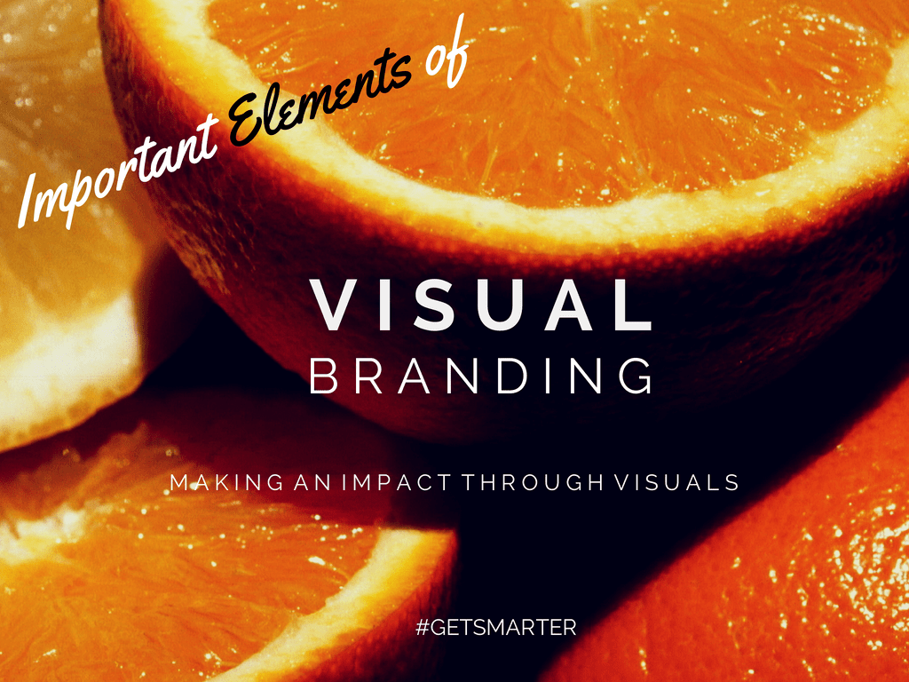
Elements of Your Visual Message
What does a new home-based business owner come up with when he doesn’t have the funds to hire a graphic designer for his logo? An overused font with no real distinction he can call his own. Of course, he still may be very successful with his new construction business, but there will come a time when that success requires a rebranding in order to get beyond a plateau.
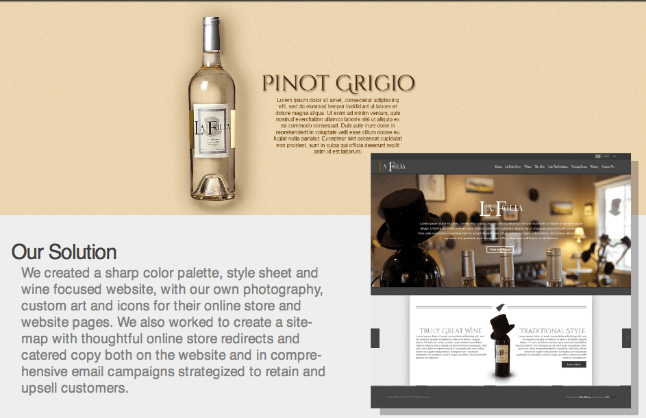 CLICK HERE to download our case studies and see how we recently rebranded a construction company, a winery and other clients.
And why would rebranding even be necessary? Because the elements of your visual brand need to be as distinctive as the products or services you provide. When combined, these elements should convey a message that only your company can be associated with, rather than lost in a sea of similarity. There are three main aspects of your visual brand that deserve careful consideration.
1. Color
Colors evoke neuro responses. According to a study released in April 2014 by the University of Missouri – Columbia, specific colors used in a company’s logo have a significant impact how that brand is viewed by consumers. Research showed that:
- Blue = feelings of confidence, success, reliability
- Green= environmentally friendly, toughness, durability, masculinity, sustainability
- Purple= femininity, glamour, charm
- Pink = youth, imagination, fashionable
- Yellow= fun, modern
- Red= expertise, self-assurance
2. Font
Believe it or not, fonts go out of fashion. I recently saw a chiropractic office using the Papyrus font for its logo and nothing more (no color, no image). Someone saw the same and exclaimed “Isn’t that font 20 years old?” One might surmise that you should avoid using fonts in your logo that are recognizable in popular global brands like Coca-cola, and fonts that saw too much use in their initial days, like Papyrus.
Additionally, examining several font options for the same words will have different emotional results. Choose a font that fully embodies the personality you want associated with your business. And, of course, something that is legible. If any letter is hard to decipher, move on to a different font. No one wants to spend more than a couple of seconds reading your company name. They don’t want to have to decode it. Ain’t nobody got time for that!
3. Logo
Bringing color and font together, along with imagery, is supposed to be the opener to your company’s story – the “Once upon a time…” if you will. You can’t put minimum effort in this. Well, you can, but not if you want people to actually remember your business. This is how you start making an impact. Your logo either draws them in or subconsciously makes you a blade of grass in a forest full of the competition, like giant sequoias towering above you.
Dramatizations aside, there has to be cohesion between the visual aspect of your brand and the message you wish to convey to consumers. Yes, visual branding goes beyond these elements of color, font and logo – you’ve got to consider social media imagery, website design and even product design – but you’ll never fully ratify your message through those channels if you aren’t using these basic elements to their full potential.
Not sure where to start on this whole process? We have another blog post for that! Check out How to Refresh Your Brand for some great suggestions.
Faithfully yours,
The Get Smart Group
#getsmarter @getsmartgroup